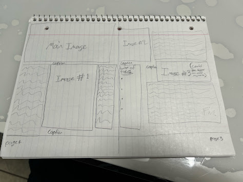
My sketch for the two-page spread is designed to create a visually dynamic experience. The 'Main Image' takes center stage, acting as the focal point and drawing the reader in. I've strategically placed 'Image #2' and 'Image #1' to create a visual flow, guiding the reader's eye across the spread. 'Image #3' is noted as potentially being larger to increase its impact, as it is a key element. I've included captions to provide context for the images and a 'List of Facts' to offer additional information. The 'Fin.' at the end indicates the conclusion of the article or section. I've laid out the pages in the standard order (Page 2 on the left, Page 3 on the right) to reflect how the reader would experience the spread when flipping through the magazine.
Subscribe to:
Post Comments (Atom)
-
When working with pictures, composition, cropping, and storage are essential aspects that affect the overall quality, impact, and longevi...
-
To prepare for CCR number three and four, I must consider these questions: How did your production skills develop throughout this proje...
-
When my class was told that we would have to conduct interviews for our project, I went straight to brainstorming. I had the privilege ...


No comments:
Post a Comment